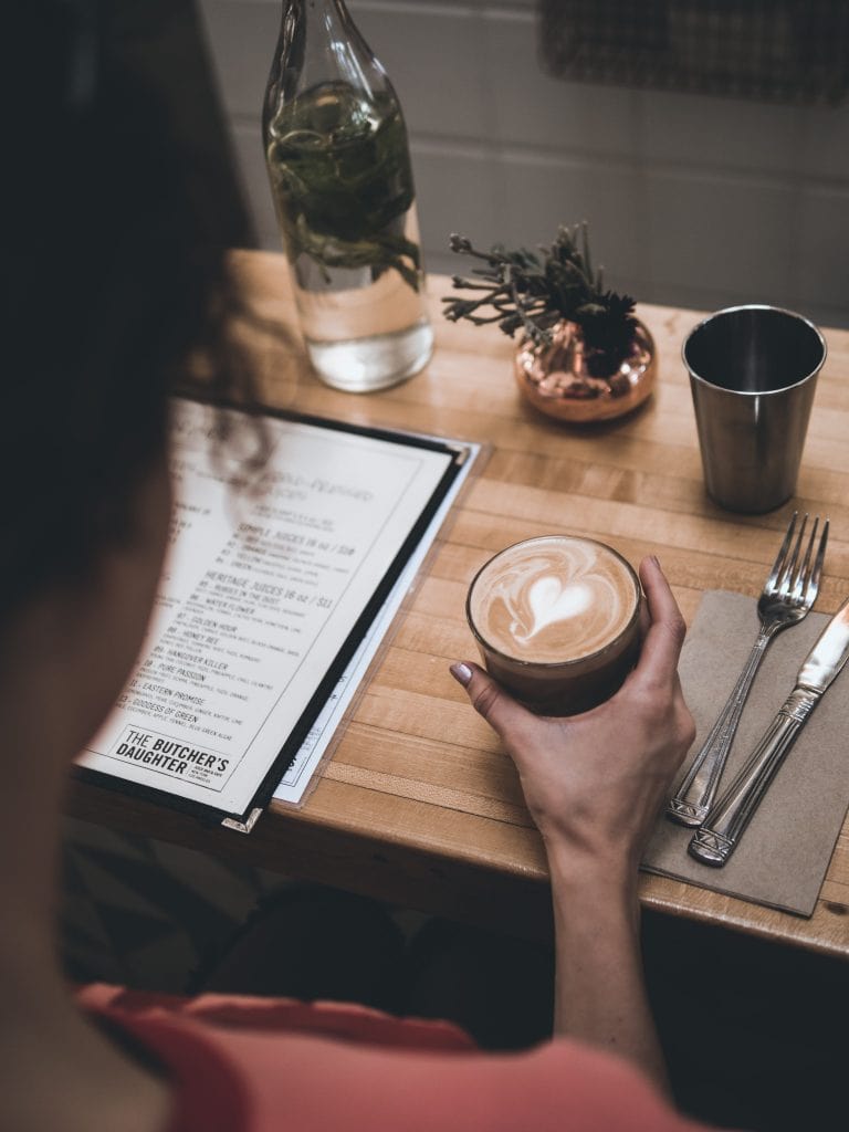
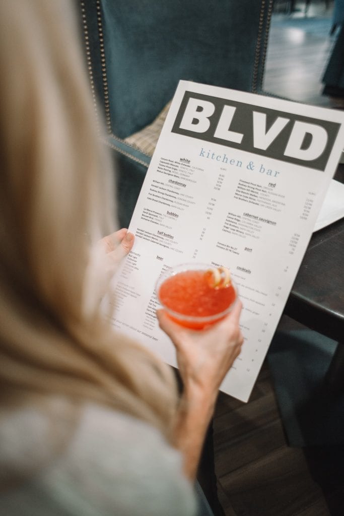
Your restaurant menu is a central advertising tool as it educates your customers about the food experience they will have at the restaurant. Here are some restaurant menu ideas that are sure to make you profit.
First of all, here is the structure of a good menu.
- Menu content : Food items that will be included in the menu
- Accompanying text : Description of the dishes
- Prices of each item
Now, that we know the elements of a menu, let’s get into details of how to make your restaurant menu to drive up your sales.
1. Pay Attention to Pricing Elements
No one places an order without seeing the price. Thus, it is a factor that attracts lots of attention during a customer’s decision-making process. You can’t remove food pricings, but you can nullify the effects using some tricks.
The standard practice is to use a currency sign with mention of every food item on the menu. However, this display of currency sign makes people feel as if they are paying more. So, what you can do is that you can write the price in words instead of using numbers. However, if you want to use numbers, one major trick is not to finish your price at .99. Instead, go for an amount lower than .99, like .95 as it will appear friendlier.
You should also avoid using dotted lines which lead the food item to its price. Although it makes the menu appear clean and formatted, it also lets the user to effortlessly locate the lower-priced items, which is ultimately not ideal for sales. So, write the prices distinctly after each item description and use fonts of the same size.

2. Categorise Menu Items Based on Popularity and Profit
There are four main categories that you should base your menu on, and they are not just about entrees, mains, desserts or beverages. These four categories allow you to construct your menu based on popularity and profit basis.
Stars: Most popular and highly profitable food items.
Plow-horses: Also in demand but have low profitability.
Puzzles: Highly profitable items but are not very popular.
Dogs: Dishes that are not very popular or profitable.
Each category represents different levels of popularity and profitability of your food items. Run a cost and sales data analysis and classify all your food items based on these categories. You can use your point-of-sale data to perform the analysis. Once you have identified them, use those dishes to guide the menu engineering effort based on maximum profit impact.
Moreover, don’t forget to allure customers to order high margin food items by keeping a low price difference between ordinary and exclusive deals. The less price difference encourages patrons to purchase the more expensive version due to the perceived better quality of more costly food items.
3. Place High-Margin Items in the Golden Triangle
The golden triangle is based on human eye movement. Our eyes generally grace the middle area first, and then move to the top right corner, before finally moving to the top left corner.
The Golden Triangle is the portion of your menu that first grabs the attention of the reader. It is the best place to put your most profitable dishes such as the stars and puzzle items. You can effectively use them for displaying decoys.
4. Use Photos Carefully
Do you know that a photo has the ability to increase the sale of an item by 30% when there is only one on the page? It’s true as per the research conducted by restaurant menu design expert Gregg Rapp. Having several photos on every page will only cause clutter and confuse customers.
Don’t forget about the photo quality because a low-quality photo will create not only an unappetizing perception of the item but also a negative perception of the brand.
Use attractive, high-quality photos. You can use one or two on each page and put these in the start and the end of the page to highlight the popular items or the most profitable ones.
5. Write Clear Food Labels and Descriptions
A well-written description can make diners feel more satisfied with their order. Not all food items can be visualised. Make use of words that clearly define the dish so that the readers can know what they are ordering and get the right feel of the item before ordering.
The description should include all key ingredients, the style of cuisine, and use descriptive adjectives to paint a vivid mental picture of the dish. Keep it short. Simply take one or two small sentences and make them sound homey and comforting.
6. Consider Colour Choice
Your colour choice for your menu also plays an important role. The colours should always reflect and represent the theme of your restaurant. For example, if you don’t use the colours of your logo on the menu, your menu would appear off-brand and disjointed from the rest of your restaurant.
Furthermore, use some contrasting colours to make your menu both attractive to the eye and easy to read. To delve even deeper, make use of colour psychology.

7. Product Placement Matters
People usually look at the first two items in a menu and then scan to the last item. Research has shown that the menu is also read like a book, from the top left to down, and then to the next column if there is one.
Make use of this fact and showcase those food items that are high-revenue, new or old favourites in the first two spots of a section, or at the end.
Restaurant menu designing is part creativity and part science as a well-planned menu is the key to providing the best dining experience for customers. So, make use of these brilliant menu design ideas that are bound to boost your sales.


